
Data Field Configuration
Convergence allows customization of the data entry fields on nearly every form in the system. Every business has a different business model and different data requirements, and customized data fields allow you to create a blank for anything you need to enter, where it needs to go. Data entry fields no longer in use can be removed from forms also. Custom data fields may appear as blank text fields, menu selectors, checkboxes, multi-line text areas, or autocomplete fields. Data entry forms like the ones for case data, contact data, or case notes have their custom fields laid out by a powerful, flexible layout generator that places the fields down in order, accounting for their size, and aligning fields where possible.
In the data field admin page, data fields for cases, clients, contacts, individual contact types, case notes, invoices, and Convergence users may be added or modified. Data fields can be reordered or deactivated as well. There are features to tweak the layout and change field options. Only the admin user has the privilege to use these features.
To access the data field admin page, click 'Data Fields' in the admin section of the popup menu or navigation page. Below is a sample data field configuration for case clients, called 'Claimants' in the sample database.
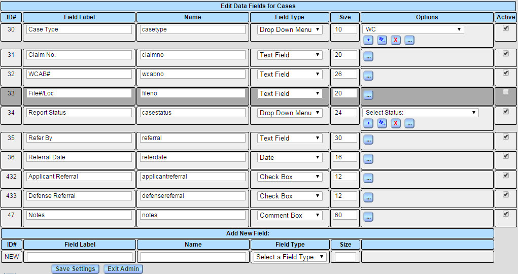
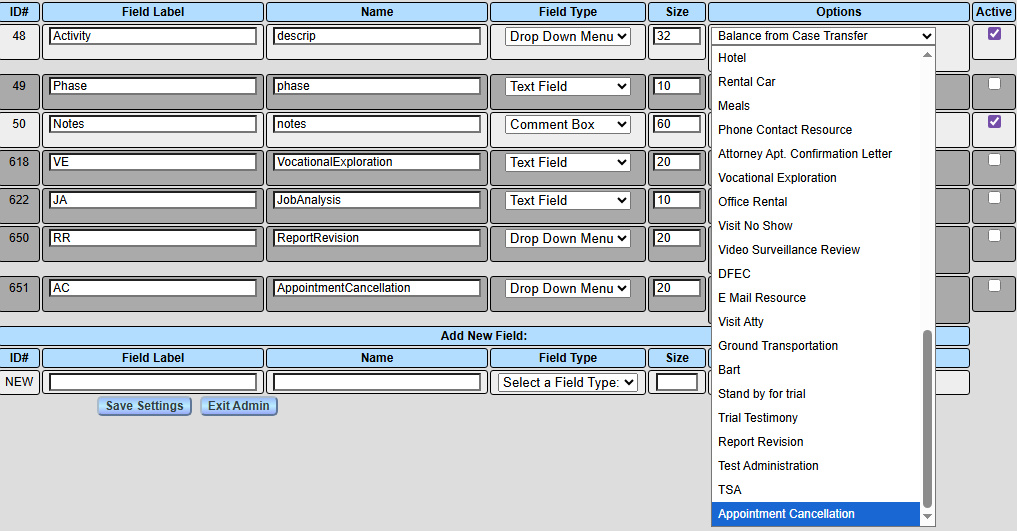
For changes to be saved, you must click 'Save Settings' in an admin form. The 'Label' for a data field is the label that will appear on a data entry form. The 'Name' column allows you to give a field an extra name for use in document templates. The field name does not appear on any user forms, only the label, and some field names have special properties. The field type selector detemines what kind of data entry field this entry is. Field types are detailed in the section below. The size for each field is the approximate width in text characters you expect the field to use up. This helps assure data fields are long enough for the data they will hold, and gives the field layout module some help setting up the layout. The 'Options' column contains a button to popup further options, and to add or delete menu options if this field has options. The 'Active' column contains checkboxes to control whether a data field is currently active or not. Fields made inactive will be grayed to indicate they are no longer in use.
Data fields saved on this form will appear in the menus of the data tag palette in the template editor. Both the label and the name of a field may be used as a basis for tag field names in document templates. The field name may be an abbreviation to help simplify document templates.
At the top of the data fields admin page is a naviagtion menu with a button 'Edit For:'. To edit fields for a different form, choose your form in the menu and click 'Edit For:'.
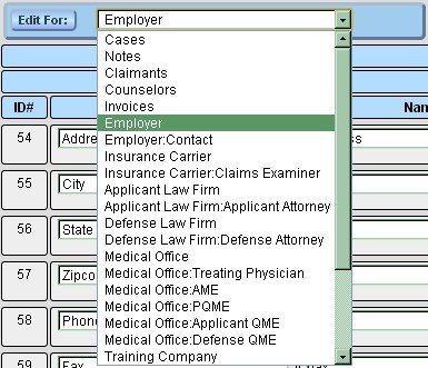
There is a menu item for cases, clients, case notes, invoices, users, and for each organization and contact type configure in the contact types admin page. At the bottom of the menu are items for going to other admin functions Preferences, Organization Types, Hourly Rates, and Color Codes.
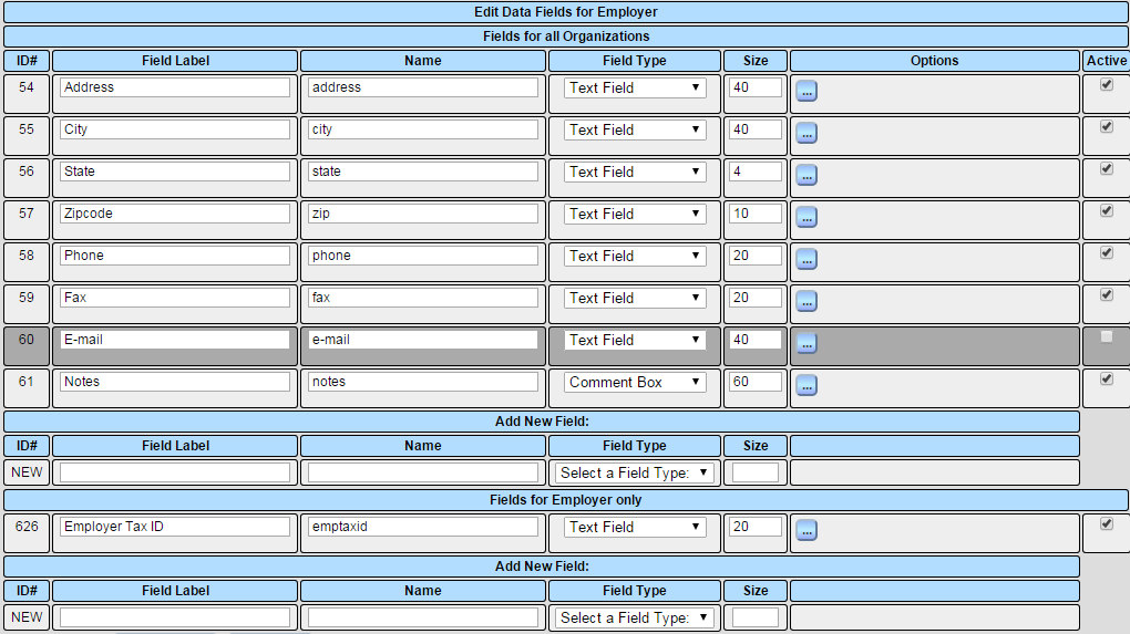
When you edit field settings for a contact or organization type, the fields are divided into those that apply to all organizatons or all contacts, and those that apply to only this contact or organization type. The allows a field that applies only to physicians to appear only on physician entry forms, or one that applies only to employers to show up on employer entry forms.
Field Types
Each data field has a field type that says what kind of field will show up on data entry forms.
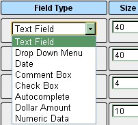
Text fields are simple text entry fields for things like name, address, etc. The size setting should be about how many characters max you expect in that field.
The 'Drop Down Menu' field type creates menu select elements on your data entry forms. If a field's type is set to 'Drop Down Menu', a menu and buttons will appear in the column 'Options' to allow editing of what choices there are for this drop down menu.
The type 'Case Date' is for entering dates. When a date field saves, the contents are regularized to the date formate MM/DD/YYYY. The interpreter is pretty flexible about what gets entered, so 'Jan 13, 2014' will be translated to '01/13/2014'.
The type 'Comment Box' is for entering multiline text, such as notes or comments. The field size can be entered as something like '80x5' which would specify a text area 80 characters wide and 5 lines tall. The box is scrolling so more text can be input than the number of lines as needed. The number of lines defaults to 5 if only a number appears in field size.
The type 'Checkbox' will set up a check box on your entry forms. If a checkbox is checked, it will have a value of 1 when it is read by the template tag interpreter.
An 'Autocomplete' is a text field that pops up suggested text as you enter text. You may pick an existing option from the suggestions, or can enter a whole new option if you wish. Those suggestion options can be managed here in the 'Options' column. This is a useful type of field where you want to assure consistent spelling of options, and still have non admin users be able to add new options when needed. When a field's type is set to 'Autocomplete', an interface will appear under 'Options' to manage what choices the autocomplete might suggest.
Fields of type 'Dollar Amount' are for money figures. When a dollar amount field saves, its contents are regularized into dollars and cents. If the contents of the field cannot be parsed into dollars and cents, the field will be left empty.
The type 'Numeric Data' is for fields that must be numbers. If a field is going to be used for comparison with a number, or in a calculation, it should be a numeric field. On saving, Convergence will set the contents to a number, ignoring non-numeric text, and leaving the field empty if no numbers are found.
Changing Field Options
The field types 'Drop Down Menu' and 'Autocomplete' have options to choose from associated with them. For these fields, the 'Options' column will contain a menu of the options for that field, and buttons to add or delete options from the menu. The delete button will not show if there are no options to delete.
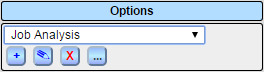
The blue '+' button will prompt you for the name of a new menu option.
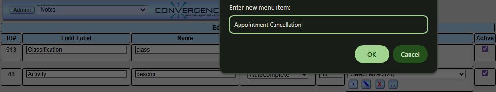
The new menu item will appear at the bottom of the menu after clicking OK.
The pencil button allows you to change the name of the current menu option. The red 'X' button will delete the current option after confirming you really want to delete.
The '...' button opens a popup for additional field settings. This popup will look different depending on whether the field is a drop down menu or not.
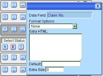
The menu 'Format Options:' contains some choices to modify how your data fields are laid out in the entry form. Most of the time, the automatic field layout will produce acceptable results. These options can be used to adjust the layout if the default layout has any issues.
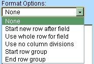
The field 'Extra HTML:' contains any extra HTML code you might want to add at the end of this field, perhaps to add a note next to a field like '(Required)' or 'Last, First M.I.'. The field 'Default:' sets a default value for a data field that will be saved in the database if the field is left blank. The 'Extra Size:' field adds extra space for the field in the layout. If extra HTML is present, some extra size might be needed to account for the field taking up more room.
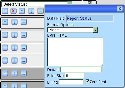
If a field is a menu or an autocomplete, some extra fields will show. A field 'Billing:' may be used to set a number of hours to bill if the current option is picked for this field. Select the option to set billing for from the option menu in the 'Options' column, and fill in the 'Billing:' field. You can switch options and enter another number, and a different number will be stored for each option. This is used to set automatic time to bill when certain case note activities are selected for a new note.
The checkbox 'Zero First' sets whether the first choice in a menu field is a null entry, something like 'Select a Case Type:' which isn't actually selecting anything. A menu whose first choice was 'None' would also want 'Zero First' checked. This field only shows up on the extra options popup if this is a menu field. Autocomplete fields don't use it.
Reordering Custom Fields
The order of fields you see is the order of fields top to bottom, left to right, that will appear in entry form layouts like a case or invoice screen. This order can be changed by grabbing a field's row and dragging it to its new place. The new order will be saved when 'Save Settings' is clicked, along with any other changes made.
Deactivating Custom Fields
A data field no longer in use may be deactivated by unchecking its checkbox in the 'Active' column, and clicking the 'Save Settings' button after all changes are made. An inactive field will show up on the field admin page with a gray color to make it clear that it is no longer active. Data fields are not deleted so that any historical case documents referring to discontinued fields will still show the correct old data. Data fields that were never used can simply be renamed.

Special Purpose Data Fields
Some data fields have special functions in Convergence and should not be removed. These fields are referenced by parts of the Convergence software, and some features will not work well without them. These fields can be relabeled since they can be identified by their names on this page, which are the how the software looks them up.
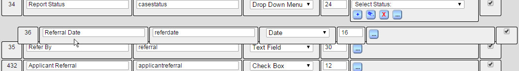
For case notes, a field with name 'descrip' or labeled 'Actvity' is the note field that is listed in case note lists, and becomes the name of an invoice line item when invoices are created. It is usually a Drop Down Menu or Autocomplete so that it holds a list of options for case activities asssociated with a note.
For cases, a field with the string 'status' in its name is required to report the case status, and a field named 'casetype' is needed for reporting case type for case type dependent settings. A field named 'referdate' is used for the 'Referral Date' column in case lists. A field named 'retainer' will become an invoice item with a credit when an invoice is generated. It is only used once per case. A field named 'retainerdate' will hold the date for the invoice item. A field named 'value' will be the inventory value of the case.
This manual is published by Convergence Case Management Data Retrieval Software, LLC, whose software products are provided for use by parties who have paid for and have a current license to operate the software described herein.
Information in this manual is subject to change without notice, and does not represent any commitment on the part of Convergence Case Management Data Retrieval Software, LLC. The software described in this manual is furnished under a license agreement and may be used only in accordance with its terms and conditions.
© Copyright 2026 Convergence Case Management Data Retrieval Software, LLC
This manual contains propietary information which is protected by Copyright. No part of this document may be reproduced, translated into any language or computer language, or transmitted in any form whatsoever without the prior written consent of Convergence Case Management Data Retrieval Software, LLC.